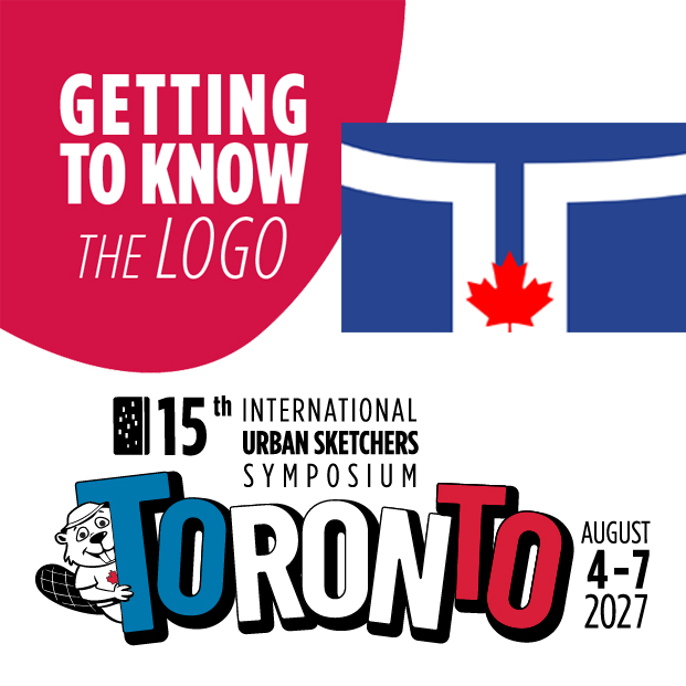
 A lot of thought goes into every symposium logo. The 2027 Toronto logo is no exception!
The logo was designed by Darya Rakitine, and the team shared the thinking and inspiration behind the design.
Inspired by the liveliness of the city, the bouncing block letters of Toronto evoke that energy while the colours are synonymous with both Toronto and Canada.
Where red & white are often associated with Canada, blue is actually prevalent in many Toronto elements like the city of Toronto flag and logo, where the design cues call on the iconic curved towers of City Hall forming a T, as well as a number of the Toronto sports teams’ colours.
